Over at Carpe Diem, Mark Perry has a pair rather interesting charts:
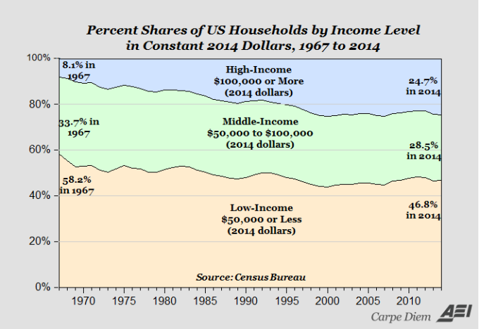
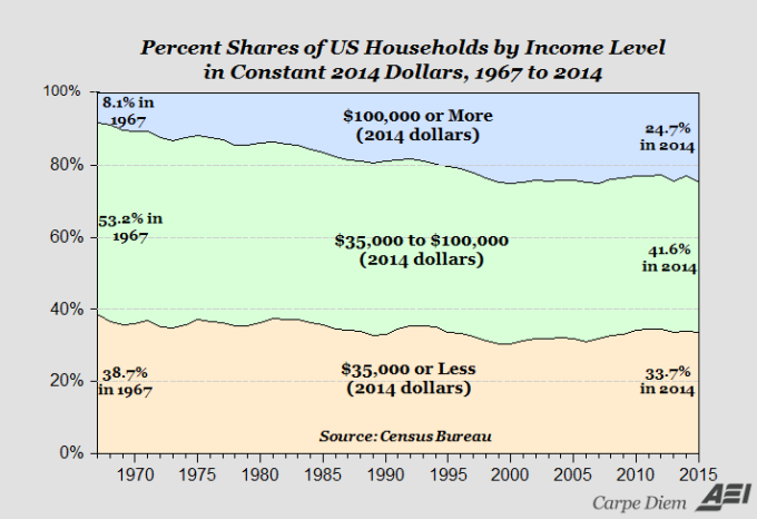
These charts show US household shares in various income groups in constant (that is, inflation-adjusted) dollars. For example, the bottom chart shoes that 24.7% of US households in 2014 earned $100,000+ per year.
Mark’s point with these charts is that the Middle Class is disappearing, but they are moving into the upper class. That certainly is true: in both charts, the Middle Class’ shares are lower in 2014 than they were in 1967. I think is also a major take-away from this is the decline in the Lower income group as well. In both cases, the Low-Income group’s shares are falling as well. In real terms, this means that fewer and fewer US households are in the bottom levels of society. So, the rich are getting richer, but the poor are getting richer, too.
This data is confirmed in a report by the Financial Times.
The 1960’s may have been the height of the Middle Class, but it looks like the 2000’s will be the rise of the Upper Class

Jon
The FT piece seems to be another whine about the “hollowing out” of the middle class and increased inequality, But the animated .GIF near the top shows the same good news your (and Mark’s) charts show.
Perhaps Messrs. Fleming and Donnan need to brush up their graph interpreting skills.
LikeLike
Yes it is. But the data is still good, even if the authors do misconstrue it.
LikeLike
Reblogged this on Utopia – you are standing in it!.
LikeLike
These charts assume I think that one deflator is appropriate for all groups. Is it? If the deflator for the market basket of the low-income group were a few basis points higher than the composite deflator, I suspect the charts would look quite different.
LikeLike
Add to these charts the fact, as Professor Bordeaux does, our “money” buys more and we have more choices now than in 1967, 1975, 1985 or even 1995 and the picture is even better.
LikeLike